Background
Meta is a concept brand with five sub-brands. These five sub-brands include: Fitness, App Games, Music, TV, and E-books. During this case competition at my internship with Red Ventures, my team of two copywriters and I created the look and feel for the brand, a landing page, and a re-targeting email. I was responsible for all of the visual design for the landing page and re-targeting email and my teammates worked on all of the content for both. Together the three of us collaborated together on the brand tone and voice.
Roles/Responsibilities
UI Designer, Branding Designer, Email Designer
Tools Used
Figma, Adobe illustrator
Design Solution
The design solution is a comprehensive and cohesive brand identity for five sub-brands. This solution encompassed a retargeting email campaign and a landing page.
Branding
The Meta brand design aimed to be approachable, trustworthy, reliable, fun, cheap, and secure. Unlike Apple’s sleek style and Amazon’s overwhelming approach, we focused on a welcoming and friendly feel, ensuring customers trust they’re getting a good deal without unnecessary upselling.
Logo Design
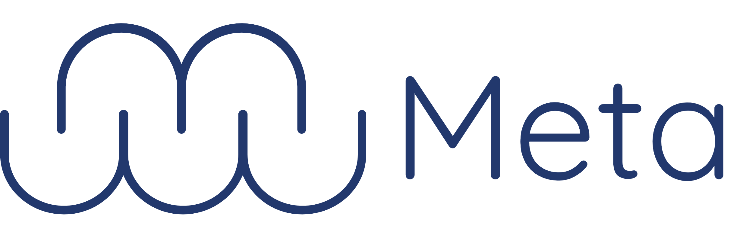
In designing the logo, I aimed for a light and airy feel to make our site seem easy to use and approachable. The ‘M’ is formed by combining five ‘U’ shapes, representing our five sub-brands, and resembles a cloud, symbolizing connectivity. I used the rounded Quicksand font and a navy blue color. Below are the iterations, including some that formed ‘B,’ ‘W,’ or ‘S’ shapes before the final design.
Logo Iterations:
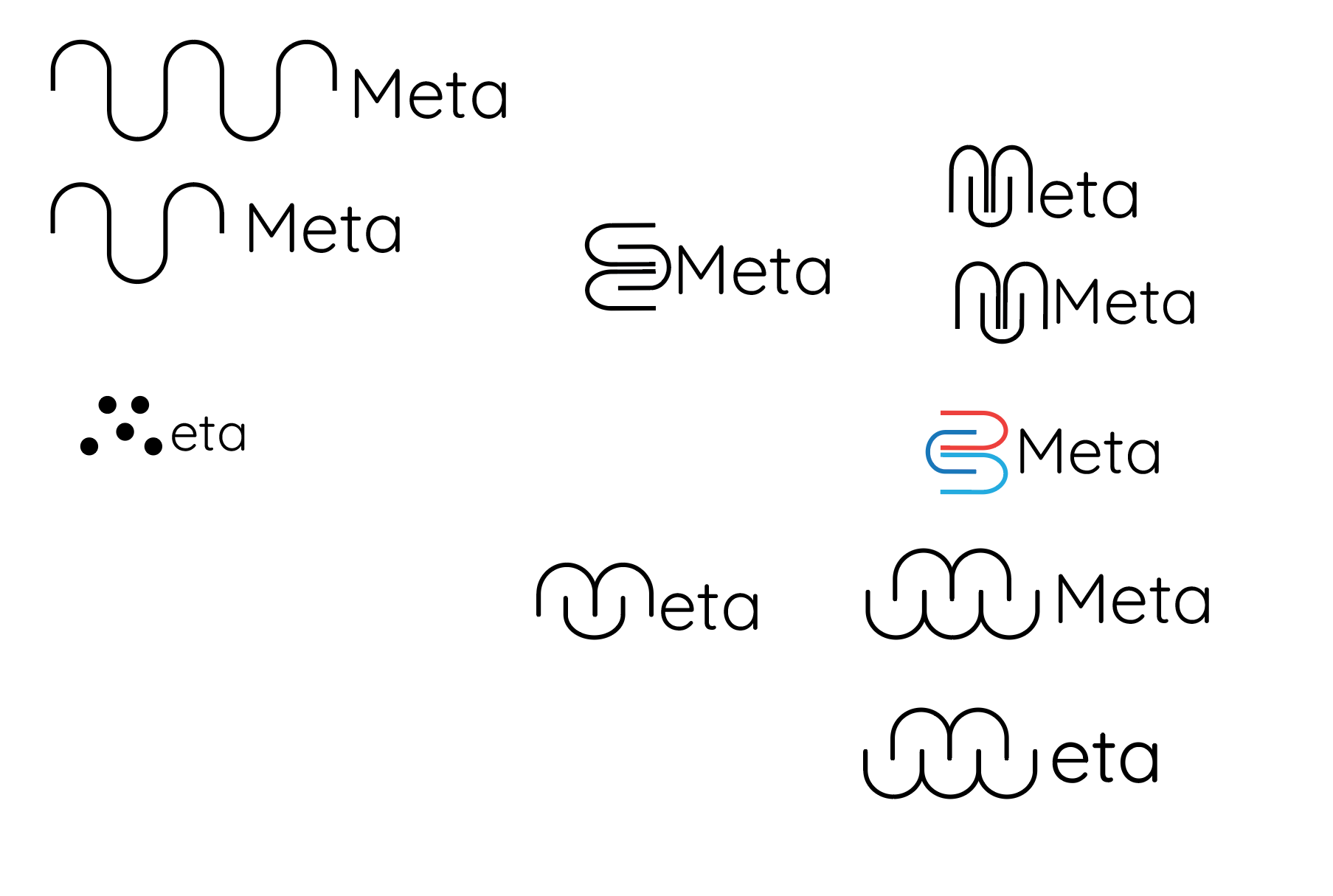
Final Logo Design:
Colors
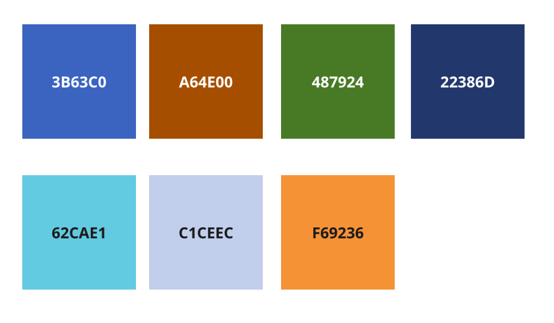
Looking at color psychology for this brand, Orange, Blue, and Green were chosen. Blue represents trust, security, and reliability; Green also signifies trust and security; and Orange conveys fun and affordability, carefully used to suggest good bargains rather than cheap quality. The final color palette is shown below.
Typography
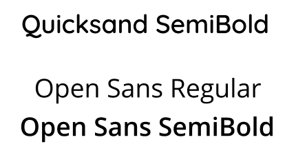
When I was figuring out what font best aligned with our brand I thought of using Quicksand for the headings because of its rounded edges to match the tone of approachable. (Rounded edges overall is a common theme throughout all of my design). After I decided to go with Quicksand I had to find a font to go with it and stuck to having a San Serif font for the body which ended up being Open Sans. Using a San Serif font for the body was due to accessibility since it is easier to read than Serif fonts.
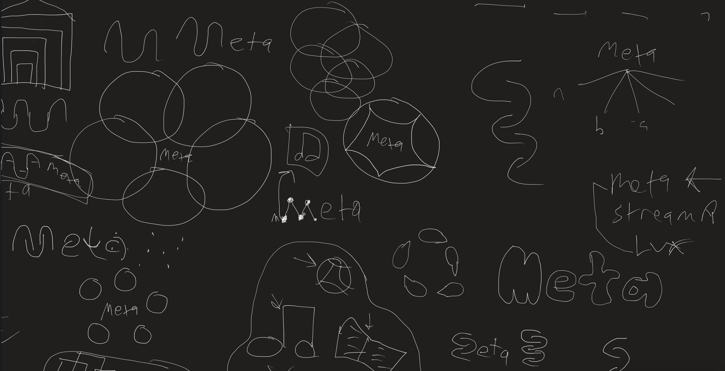
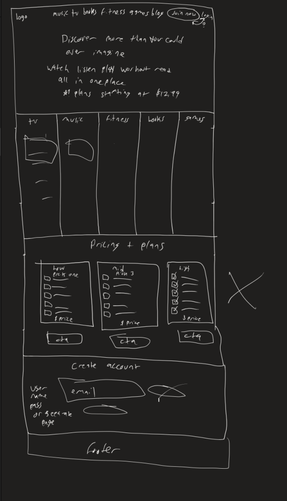
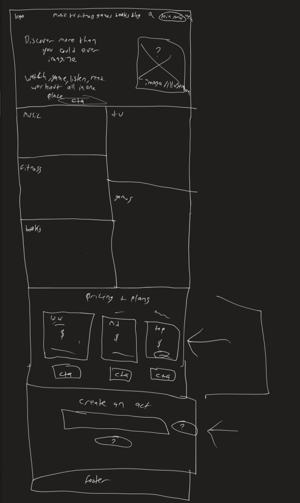
Sketches
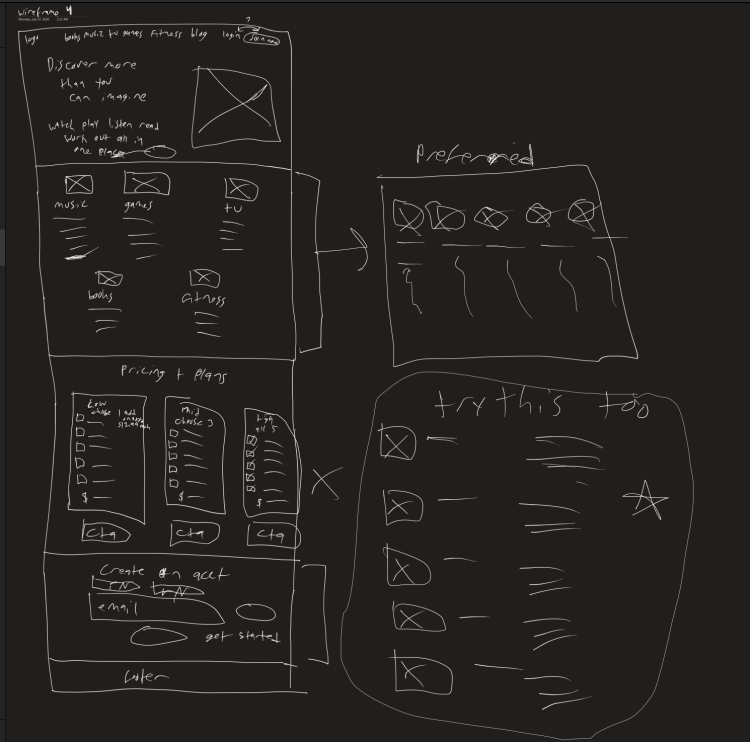
Below are some of the sketches I created for the homepage design. I ended up using different elements from different iterations that I liked for the wireframes to move forward with.
Elements to Move Forward With:
- Hero – Iteration 1
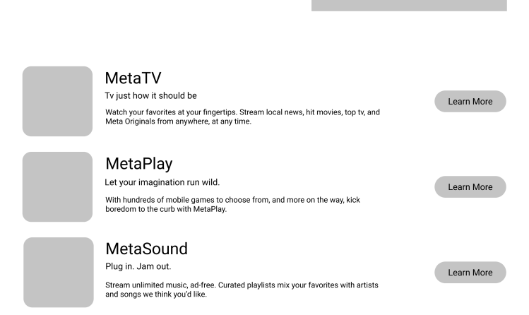
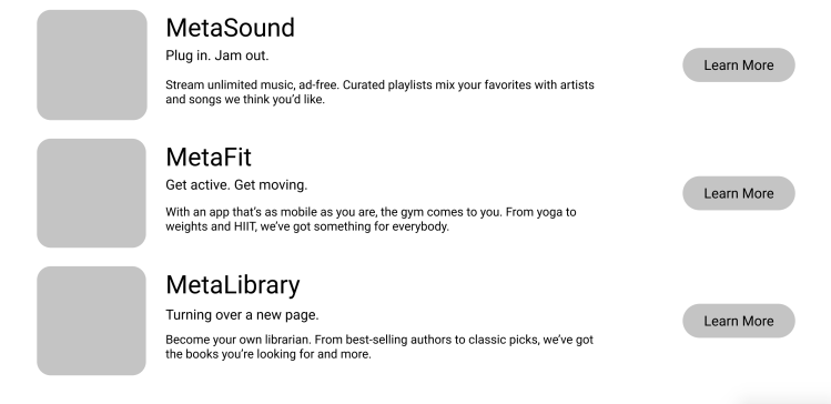
- Five Apps Listed – Part of Iteration 1
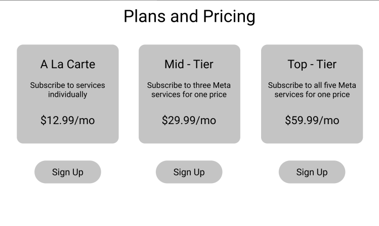
- Pricing and Plans – Iteration 3
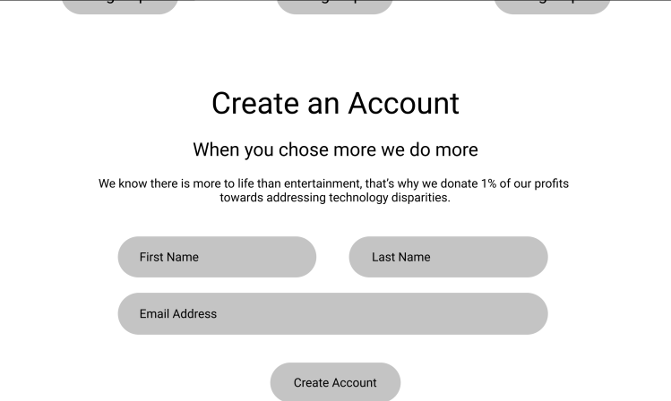
- Create an Account – All iterations (added first and last name as well as the email further on)
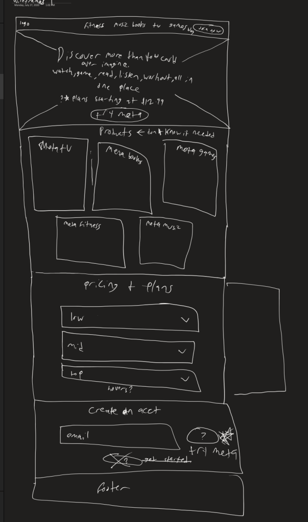
Wireframing
During the wireframing process I utilized the best ideas I had from the sketches and designed these sketches in Figma.
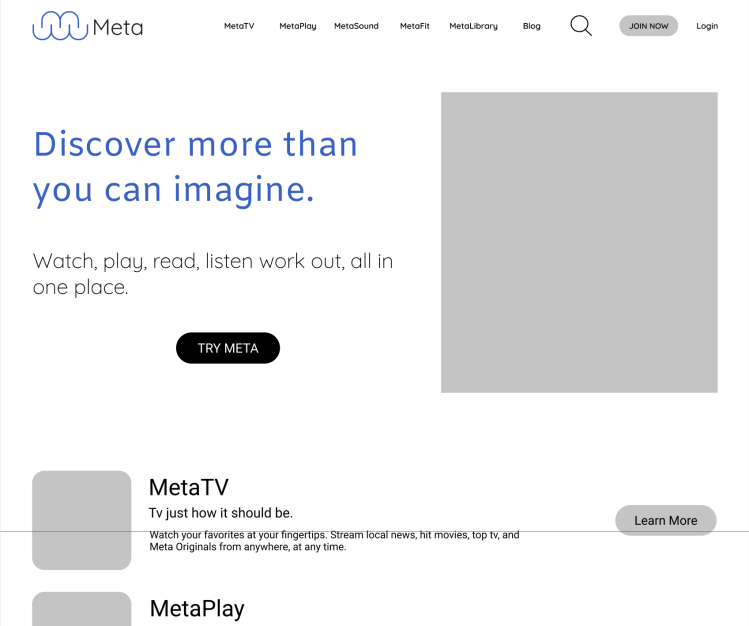
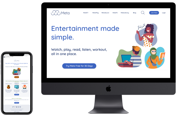
Final Mockup Designs
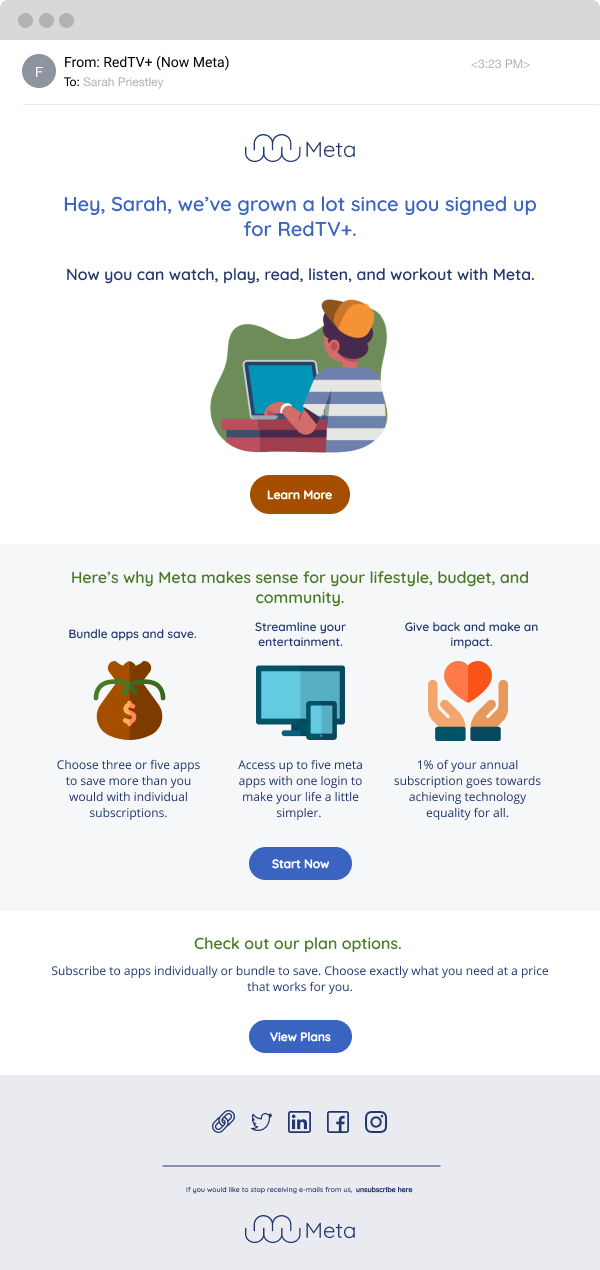
Re-Targeting Email
Landing Page
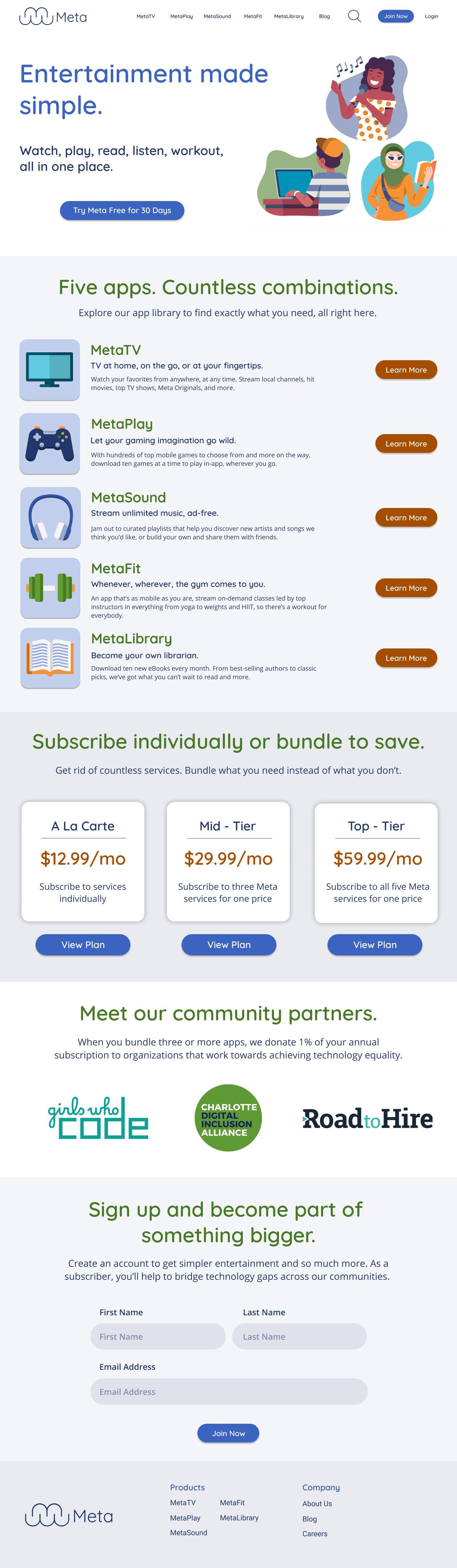
Desktop Site
Here are the sections I included and why:
- Five Apps Section: To showcase the apps as they would appear on a device, similar to how Apple presents apps in their app store.
- Plans and Pricing Cards: In the final design, I moved the price to the center and enlarged it to emphasize its importance.
- Community Partners: This section was added to highlight our commitment to social good, showing customers that part of their money supports a good cause.
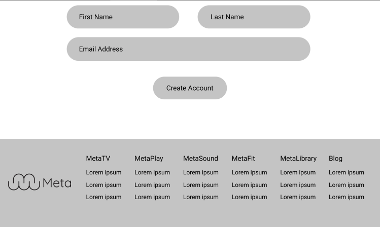
- Create an Account: I included first and last name fields in the form to personalize email marketing by using customers’ names.
- Footer: Each section of the footer represents one of our products for easy navigation.
Re-Targeting Email
For the re-targeting email I ended up building the email based off of the content that the content writer interns had completed before I started designing. When I got the content, it already drove the hierarchy of the email. Keeping one cohesive brand across marketing materials and the website keeps users from feeling the disconnect between the two. Utilizing the same style of illustrations, colors, and typography helped with this.
What I learned
- Having content available speeds up design decisions.
- Quicksand Font looks sleeker when kept thin, as it appears childish when thick.
- The design resembles an online learning platform like CodeHS or Duolingo rather than a multi-service site like Amazon or Apple.
- Action and information buttons could be more cohesive with the chosen colors.
- Writing form field labels above the fields enhances accessibility.
- I chose a light, playful color palette to align with fitness and E-books, unlike others who used darker palettes for a design sprint.
- Enlarging the apps on the site caused confusion; they looked like demo cards rather than actual app previews.
- Collaborating with copywriters allows more focus on design.
Next Steps
- Refine visual design:
- Experiment with different typography and color palettes.
- Make app previews smaller on the site.
- User test the site and email.
- Conduct more research on the five sub-brands.
- Develop layout ideas showing what each app would look like for each sub-brand.
 jenpatt-designs.com