
Background
MBA Today is a concept site re-design of OnlineMBA.com that was used to learn more skills in user experience design and research. I collaborated on this project with a copywriter intern and another design intern during my remote internship at Red Ventures. In this 5 week long project we went through the entire design process from start to finish. From user research to making wireframes to user testing those wireframes to finally working through the visual design. Below is the final mockup we presented as well as the full design process. I worked on the visual design of the landing page and my teammates and I collaborated on the research portion.
Roles/Responsibilities
UX Researcher, UX Designer, Visual Designer
Tools Used
Figma, Miro, Usertesting.com
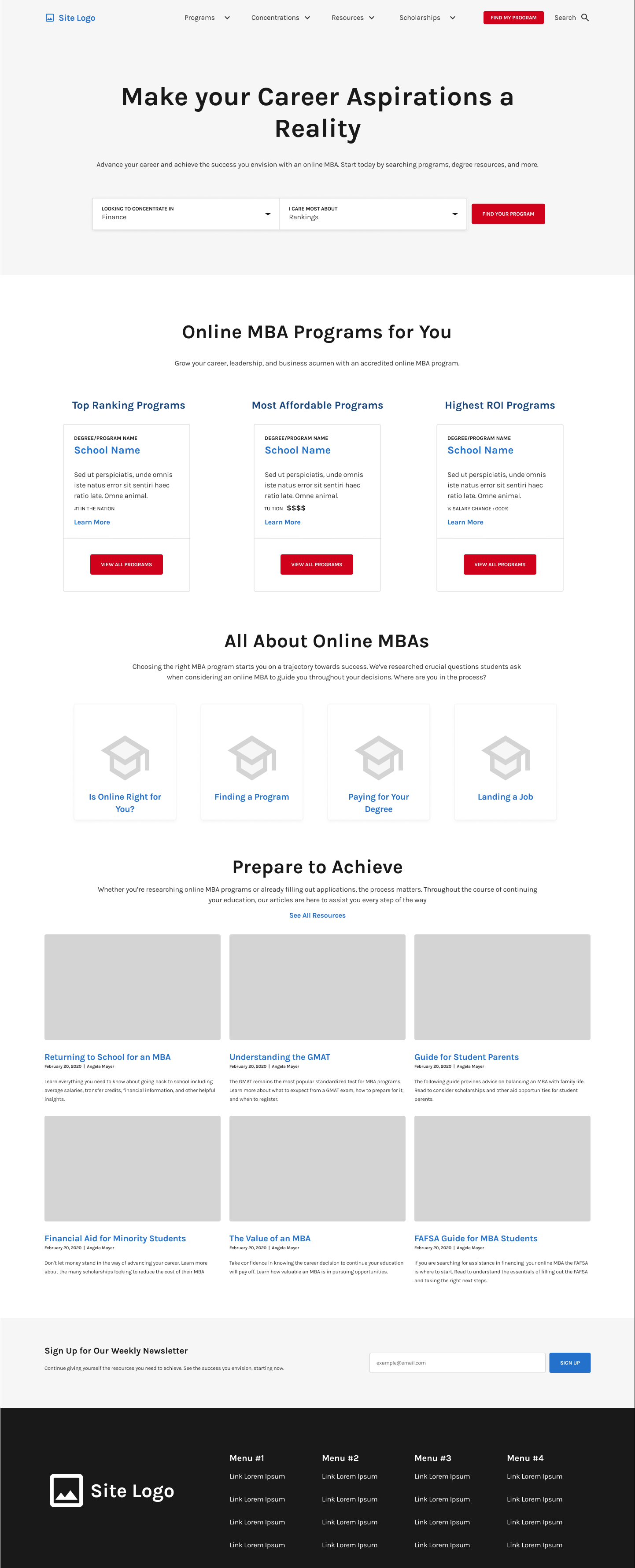
Final Site Mockup

Personas
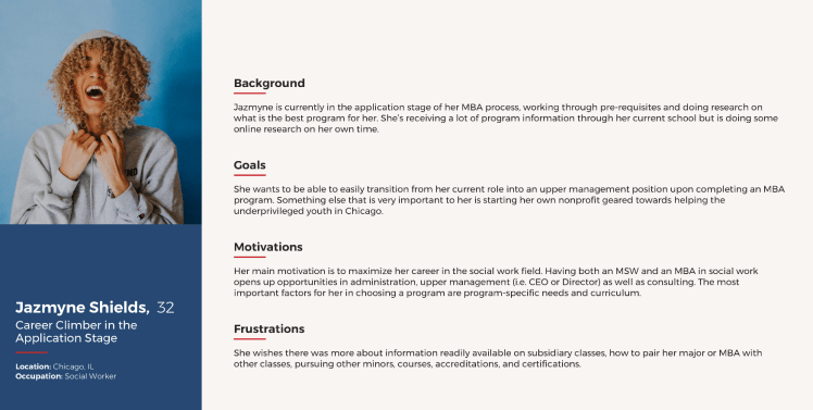
During my internship, my team and I analyzed three personas to better understand potential user scenarios to empathize with. We specifically wanted to look at personas that were looking to get online MBAs and see what their frustrations were and the reasoning behind it. Frustrations came from looking for a program, applying to a program, and choosing a program. Below is an example of one of the personas we analyzed.
Empathy Mapping
After reviewing the personas, my teammates and I did an empathy mapping exercise in Miro where we brainstormed using stickies (shown below). We looked at seven different questions to think about what our users might be influenced by. Asking ourselves these questions helped us empathize with our users to get a better understanding of how we can create a design that will help fix the frustrations they may have.
Questions we asked ourselves:
- Who are we empathizing with?
- What do they need to do?
- What do they see?
- What do they say?
- What do they do?
- What do they hear?
- What do they think and feel? (Pains/Gains)


Competitor Analysis
My team and I analyzed both direct and indirect competitors of OnlineMBA. The purpose of this analysis was to see what competitors are doing on their sites compared to ours to see what we might be able to do differently to gain more traffic.
Factors Considered:
- Site Overview
- Audience
- Features
- Messaging
- Content/Design
- Customers
What We Found:
- Many sites didn’t have a way to reach someone to ask questions easily or at all.
- Many sites had a lot of content and were confusing to navigate.
- Direct competitors had similar audience as OnlineMBA which was people looking for MBA programs.
- Some sites had options for online or in person programs though our site only focused on online.
UX Site Audit
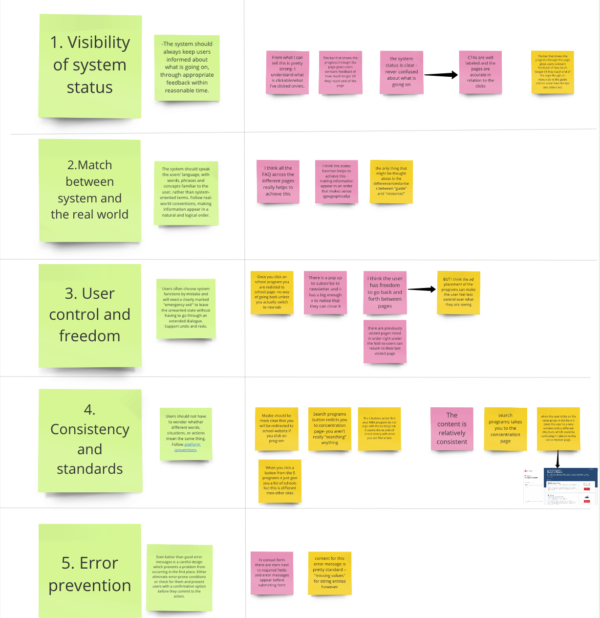
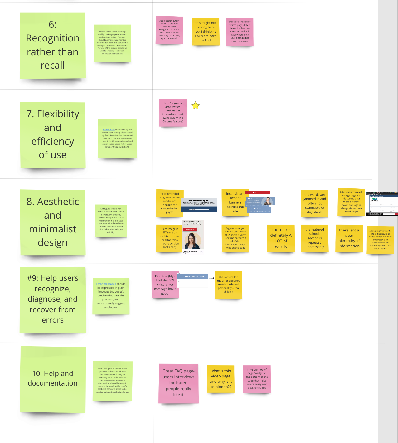
Below are ten common usability heuristics we used to analyze the current OnlineMBA site. The yellow stickies represent negative aspects of the site in each category and the pink stickies are positive aspects of the site. As you can see “Consistency and Standards” as well as “Aesthetic and Minimalist Design” needed some work on the current site. This helped me see what is currently working and not working on the site to keep this in mind when I made the new re-design.
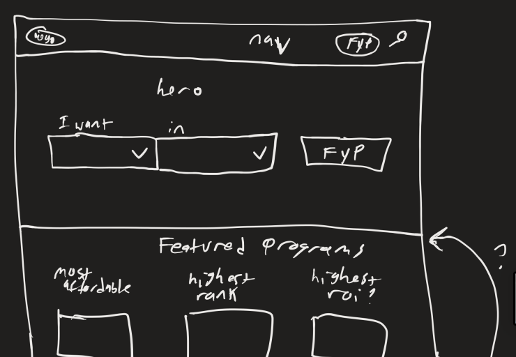
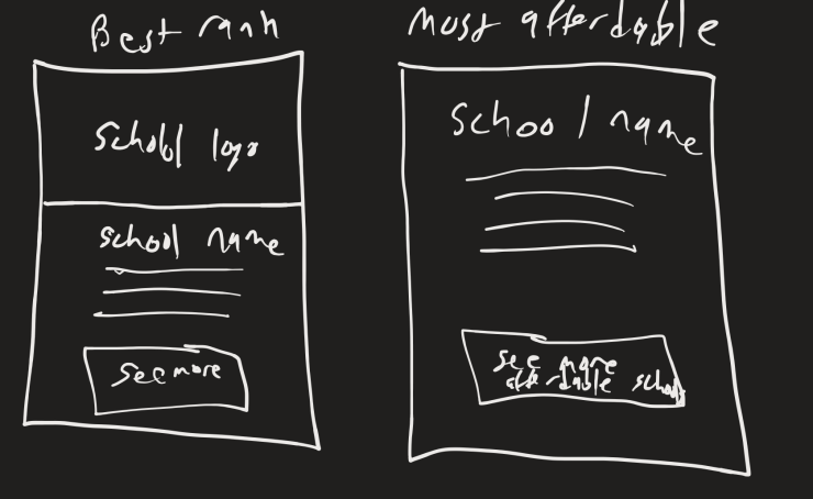
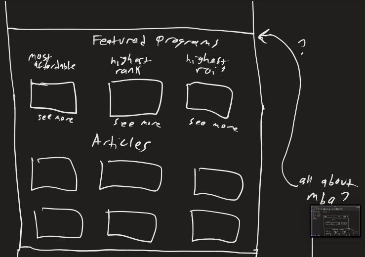
Sketching
Below are some of the initial sketches I made using Microsoft One Note with the drawing tool.
Concepts the landing page could include:
- An initial filter for programs where the user would select what they wanted (Bachelors, Masters, etc) and what concentration they wanted the degree in.
- A section to showcase the best school in three separate categories (most affordable, highest ranking, and highest rate of investment (ROI)).
- An “All About MBAs” section that would act as an FAQ for the page
- An articles section with relative topics.
- A newsletter to receive more related articles sent to the users inbox to help them engage with the site.


Wireframing
This was the first wireframe I iterated through and user tested. The results of this user testing are in the next section below. There were a couple of changes between this and the final mockup such as the addition of a student testimonials section that was added at the bottom after the newsletter later on.
User Testing
I tested my wireframe of the landing page with five users through an unmoderated recorded test using usertesting.com. We asked the users seven questions which are listed below.
Questions we asked:
- Get familiar with the homepage, What do you think is the purpose of the page? *
- What draws your attention most on the page?
- What aspects of the page were most and least helpful to you? *
- What are your initial impressions of the page?
- Describe the page in 3 words.
- Is there anything you didn’t see that you would like to see? *
- Look at the content on the page is there anything you would add or change? *
bold* = Gave us the most useful feedback
Our Findings
- Users wanted student testimonials.
- Newsletter not super helpful.
- Highest ROI was an interesting feature.
- Users kept wanting to click drop downs in filter and navigation bar (we did not prototype the site during this project unfortunately).
- Users liked the content for articles.
- A couple of users did not scroll down on the page if they had smaller screens (did not see anything below the fold line)
Further Iteration Changes:
- Addition of student testimonials section.
- Kept newsletter but made it more connected to articles section.
Visual Design
Coming from a background in computer engineering the visual design aspect of this project was the most daunting. I tackled this portion of the project in a very analytical way to start with and slowly went more with my gut feeling towards the end.
Logo Design
Towards the end of this project I decided to quickly iterate through a couple of logo designs for the new site. The old logo was not as cohesive with the new site design and I wanted to make a full mockup.


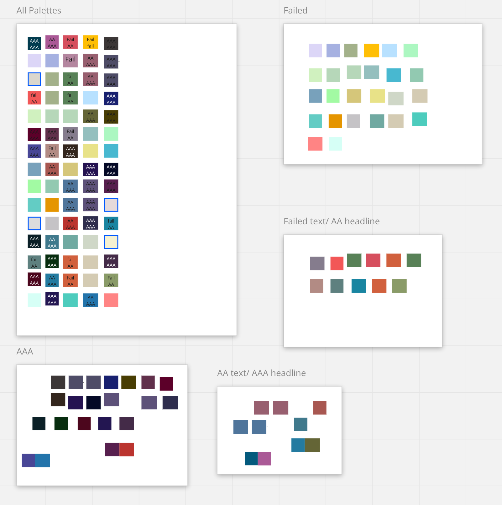
Colors
The first image in the slideshow below is what I call my color craziness.
- I started with 15 different color palettes I liked from coolors.com. Each row in the largest Miro art board represents one of the 15 different palettes.
- I checked each color ( all 75 colors) on the white background to see which were WCAG compliant. (My thoughts behind this was to make sure the colors I chose for buttons would have good contrast to the background of the site as well as the text on the buttons).
- After going through this tedious process, I noticed that all of the AAA for both Text and Headlines all looked very similar and not great colors overall.
- Asked mentor for suggestions and she told me to find two colors to be the primary colors of the site instead of finding five that worked well together to make it less overwhelming.
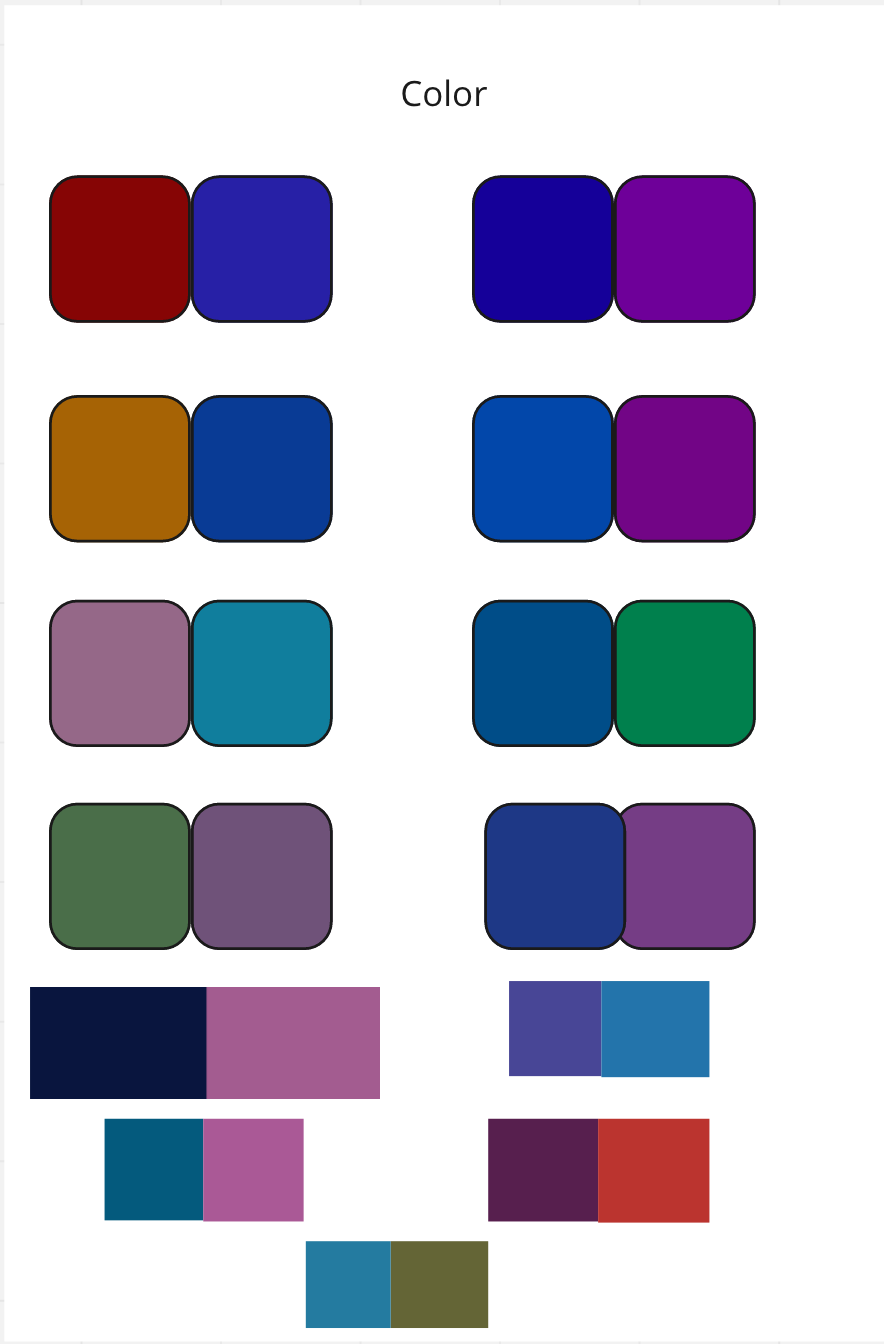
- The second image is exactly what my mentor told me to do. Finding pairs of colors that could work well as the primary colors.
- Reading into some color psychology Blue represented Trustworthiness and Reliability and Purple represented Prestige which was two things we wanted in our online MBA site.
- The final colors are here in the third image. I decided on this red-orange color and teal color for the primary colors then this lime green and periwinkle for the secondary colors.
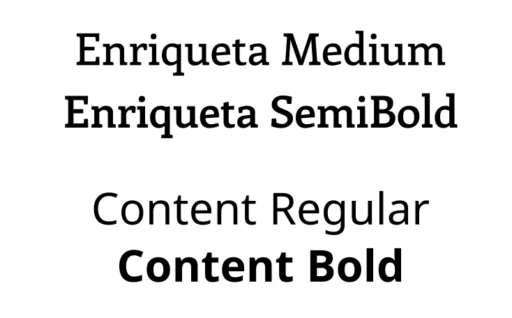
Typography
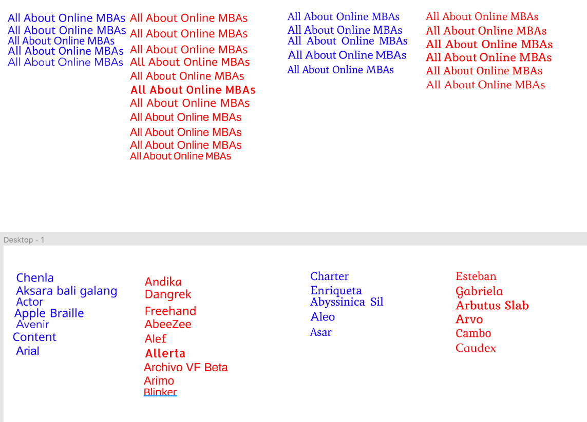
When I was looking at fonts it was very hard for me to tell the difference between some that look very similar.
- My mentor once again came to the rescue with some advice to stack fonts one on top of the other.
- Decided to go with a San Serif font for the body copy and a Serif font for the titles.
- On the left were the the San Serif fonts I liked in blue and didn’t like in red. Then to the right are the Serif fonts I liked in blue and didn’t like in red.
- Decided to use test text that would be used on the page.
- Changed the font text to the actual font it was (such as “Chenla” in Chenla font), I realized that the fonts had a much different look for some of the other characters. (My favorite example is the Gabriela font (that I wasn’t so fond of to begin with) but after seeing the ‘G’ I was definitely convinced that it wasn’t the right one).
- Final fonts chosen for the site re-design: Enriqueta and Content.These two fonts were both professional and classic which aligns well with MBA Today’s brand.
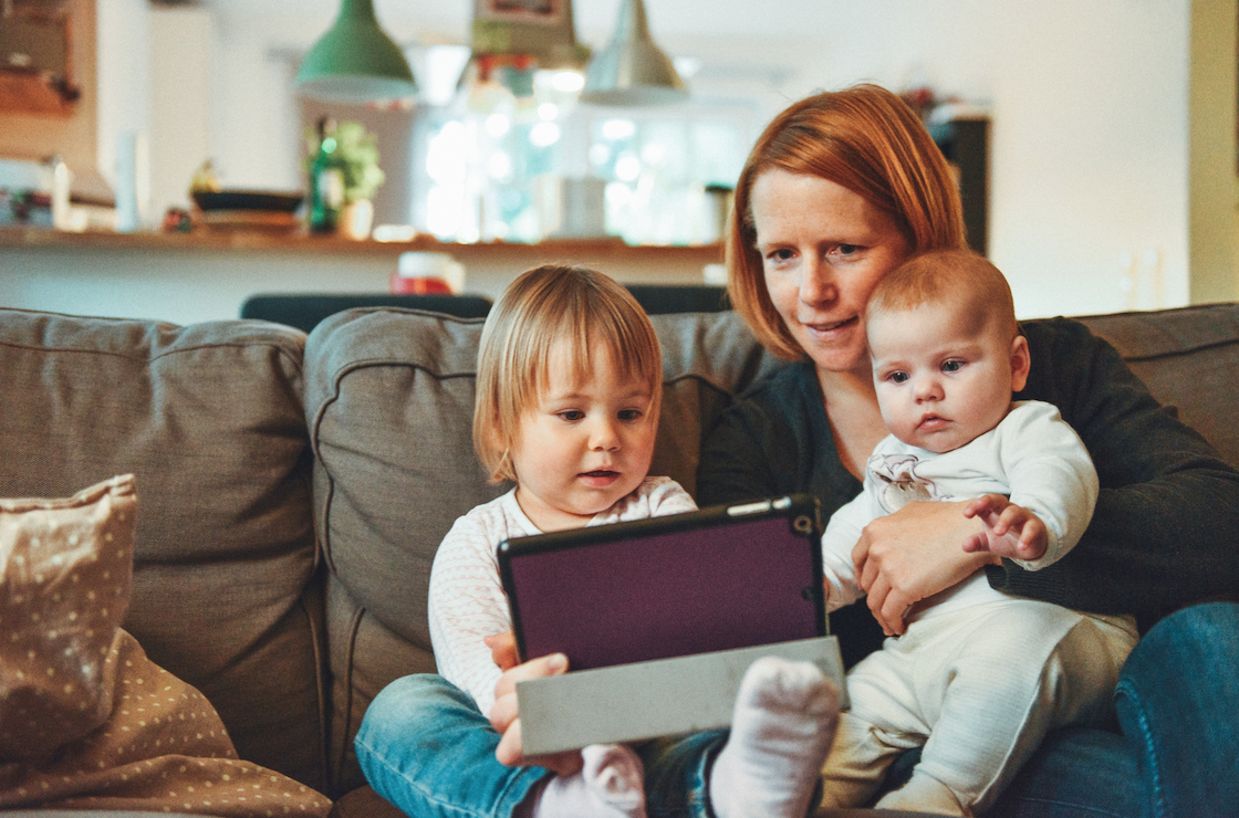
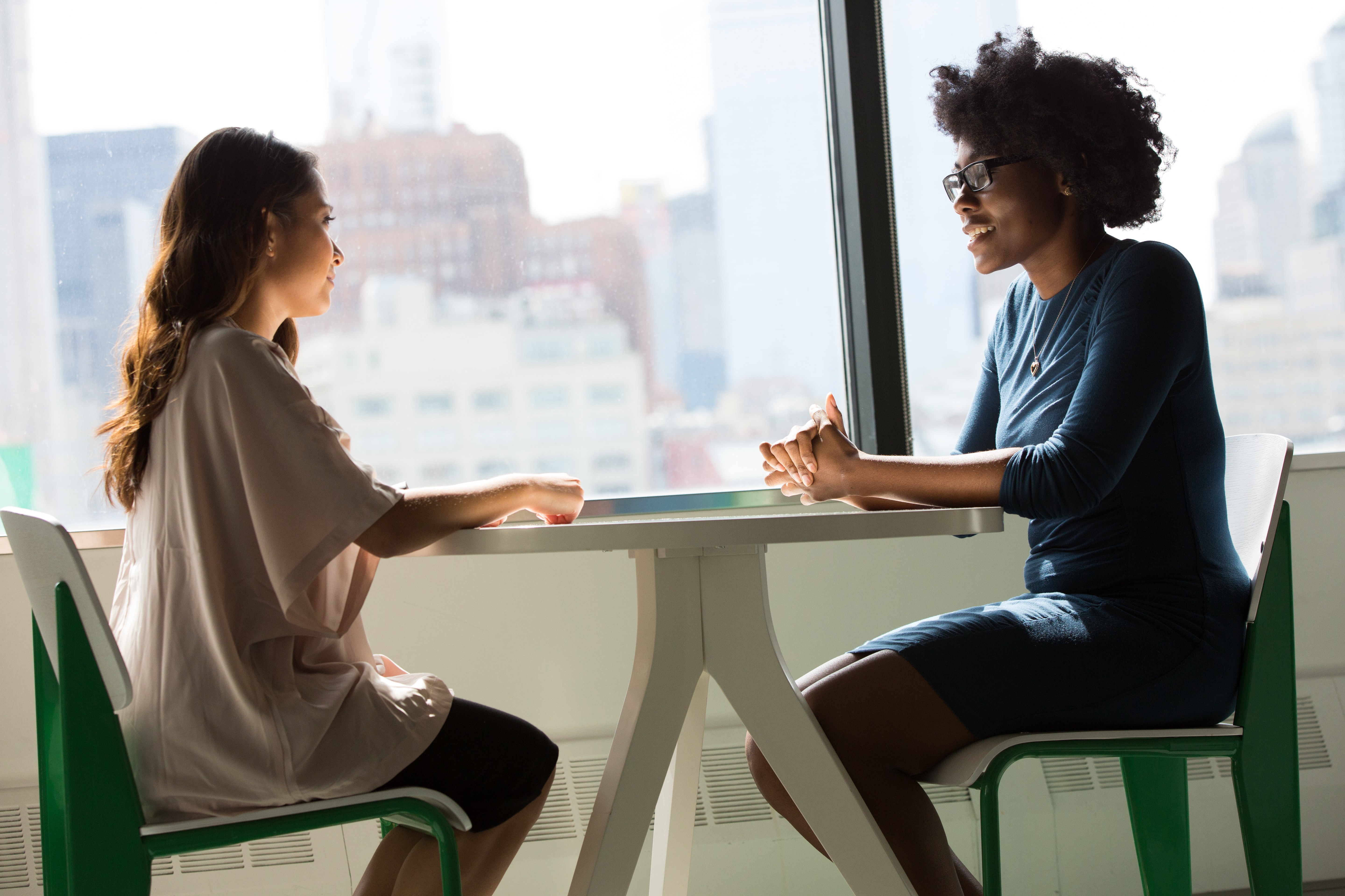
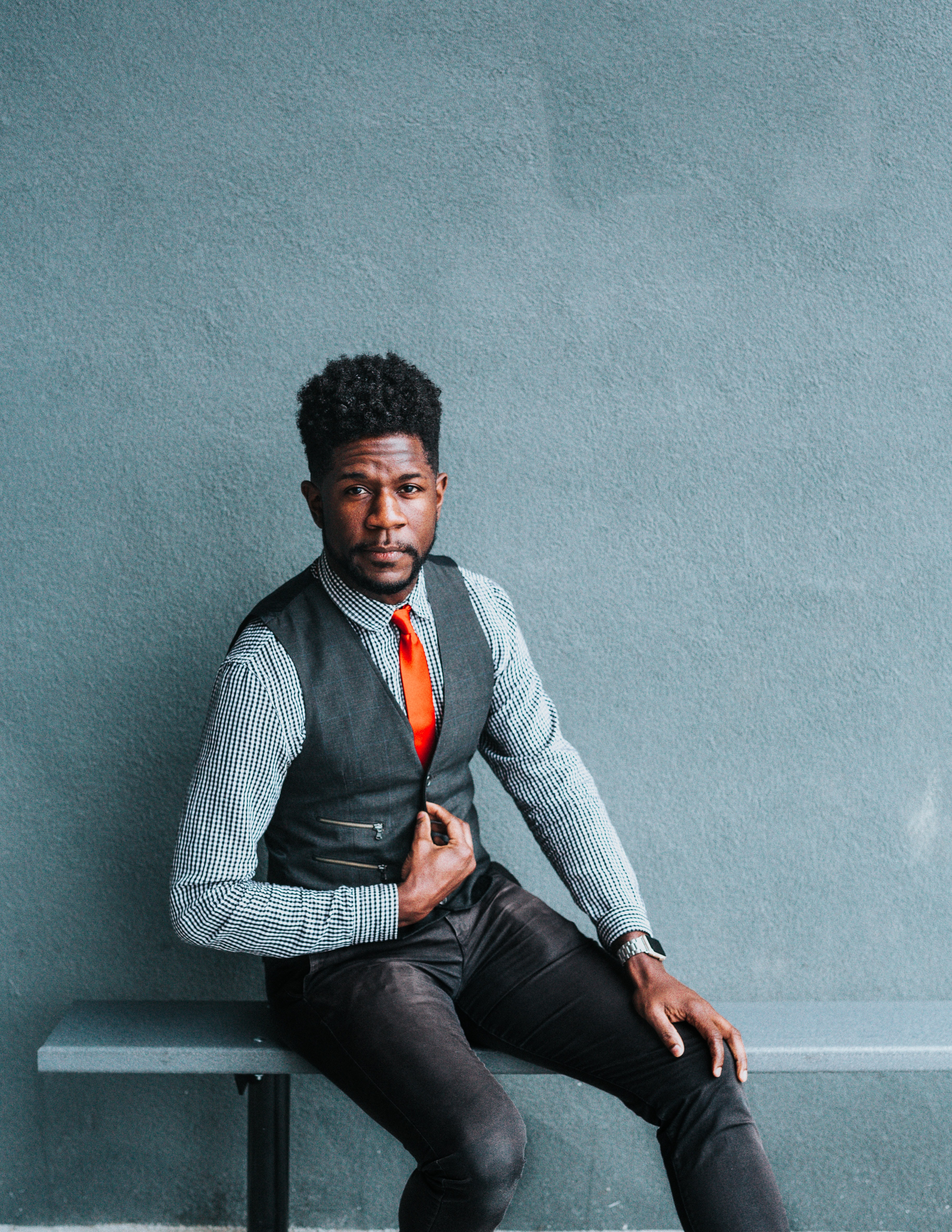
Imagery
When looking for images for the landing page, I wanted to keep these things in mind:
- Keeping it diverse.
- Photos that were relevant to the sites purpose.
- Photos that were modern.
- Keeping the site cohesive.


What I Learned
- Visual design is still an area of improvement and is still a bit of a daunting process but practice makes improvement.
- I really enjoyed working on the strategy portion of this project (User Testing especially).
- User Testing can be both entertaining and frustrating when it is unmoderated.
- The questions you ask in user testing make a huge difference.
- Writing in user testing scenarios that the user can scroll down can help users who think the page is static.
- Asking people for help when they have more expertise can help guide you in a better direction instead of feeling overwhelmed.
- Make sure when you put out a prototype link for testing that it is the correct link.
Next Steps
If I had more time on this project, here is my list of what I would do next.
- Continue with the visual design process (logo design iterations, icon design creation, etc).
- Prototype the site to have clickable buttons.
- User test the fully mocked up site.
- Start creating other pages for the site.
